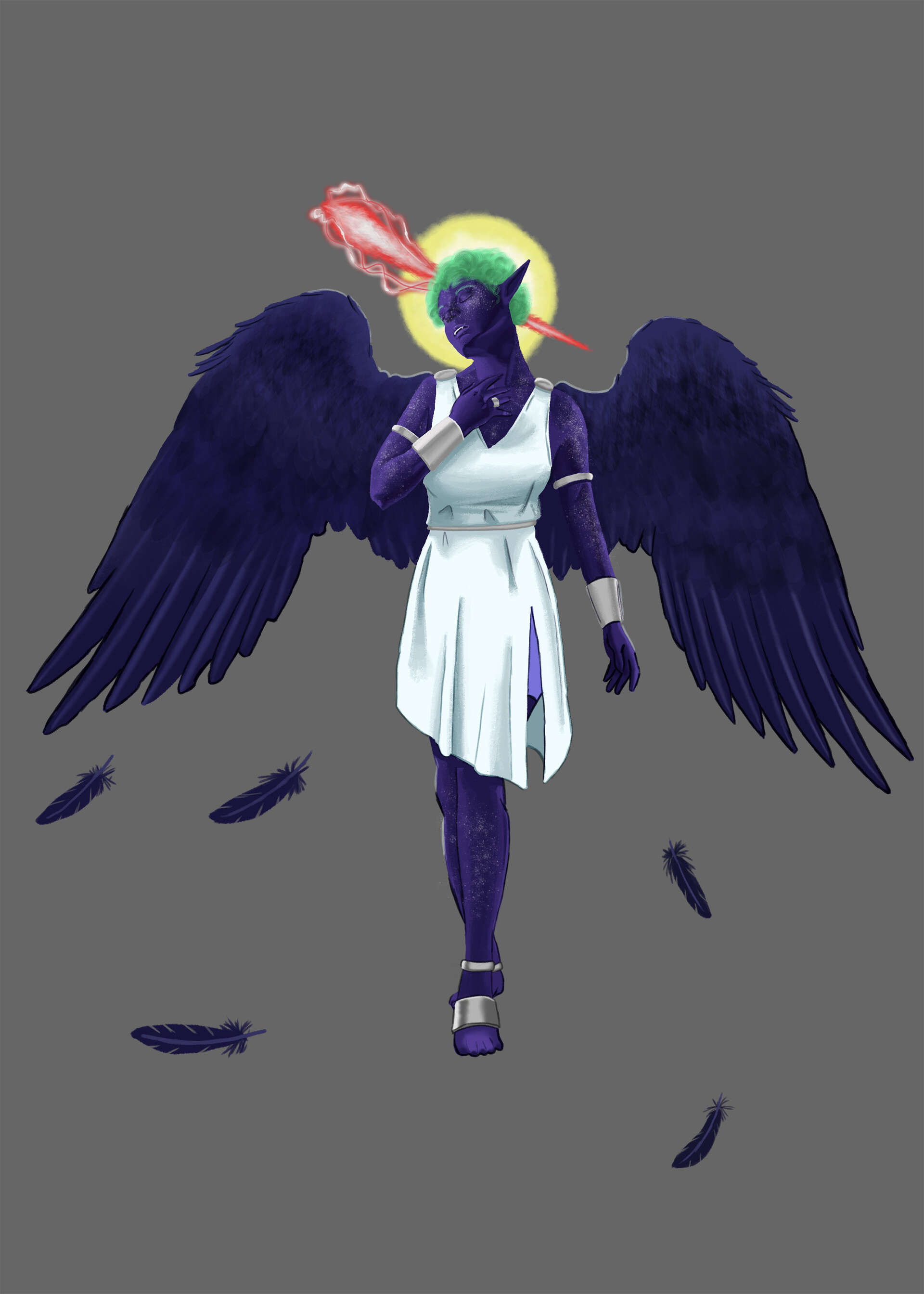
Kader, Embodiment of Innocence

Finished Piece
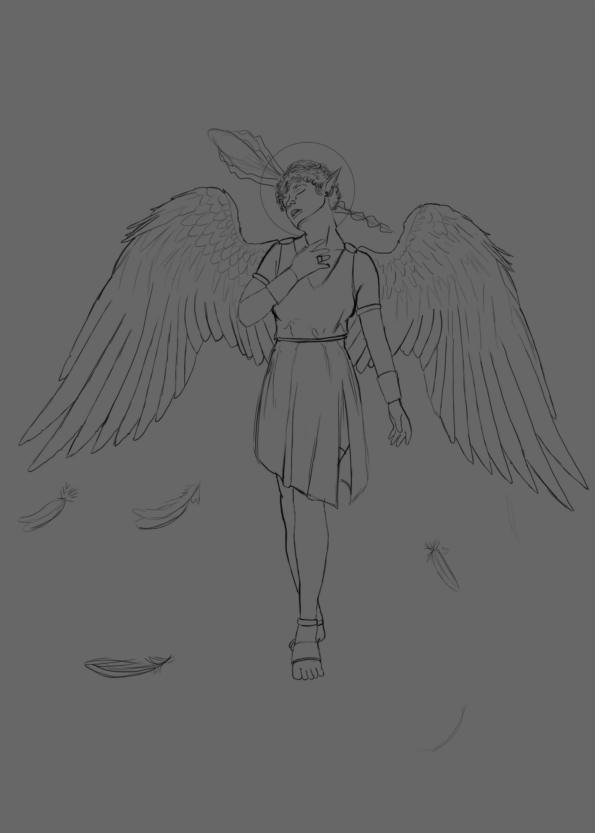
Sketch
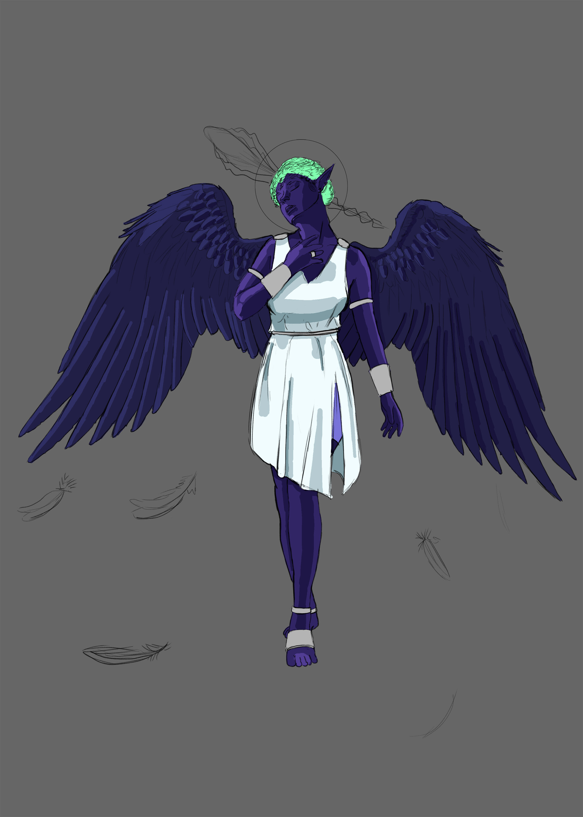
Rough Colors
Painted
Texturing and Details
Linework Emphasis
Background pre-canvas texture
A few weeks ago, I started doing a bunch of studies of an artist I really admire (Alexis Flowers, be warned, extremely mature art work, for adults only). The fall off of detail, linework, and rendering style in their illustrations was something I hoped to learn for my own work. This is the first fully original piece I painted in that style. The subject is a former D&D character of a friend I met in a TTRPG discord server.
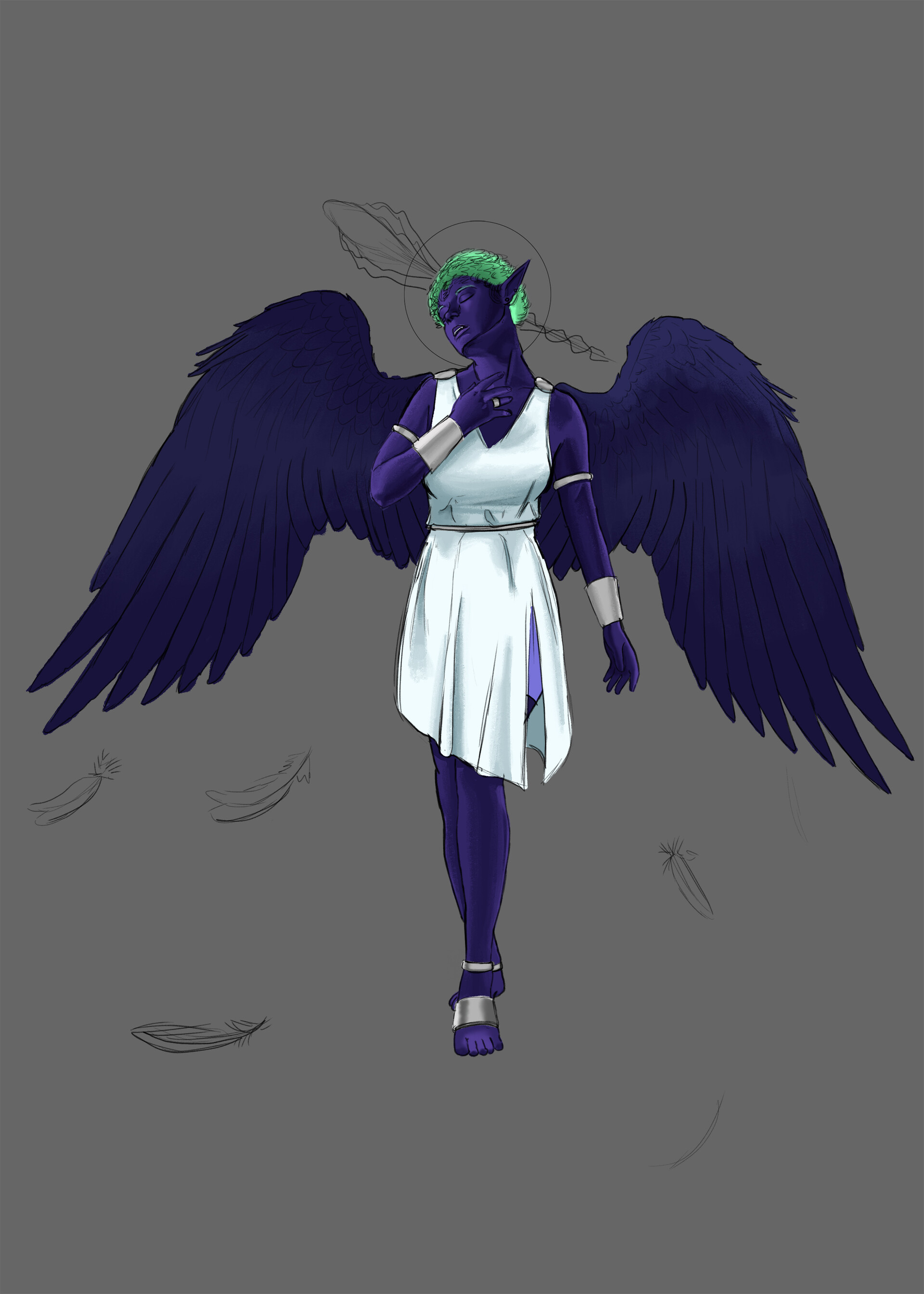
As always I start with a simple black line work sketch. The story of this character is pretty tragic, having died soon after joining the game to advance the story of another player character (this was agreed upon in advance between players!). I wanted to pay tribute to her, and her sacrifice, so I drew inspiration from artistic depictions of Christian martyrs. From here, rough colors were added. What I learned from Alexis Flower kicked in at the rendering stage. I used a much rougher chalk brush when blending the colors, hoping to get the feel of a traditionally painted piece. Additionally, I chose a narrow area of focus for detail. In that area, colors were blended much more smoothly and realistically. Outside of that area, I let detail fall away, leaving larger, chunkier sections of color.
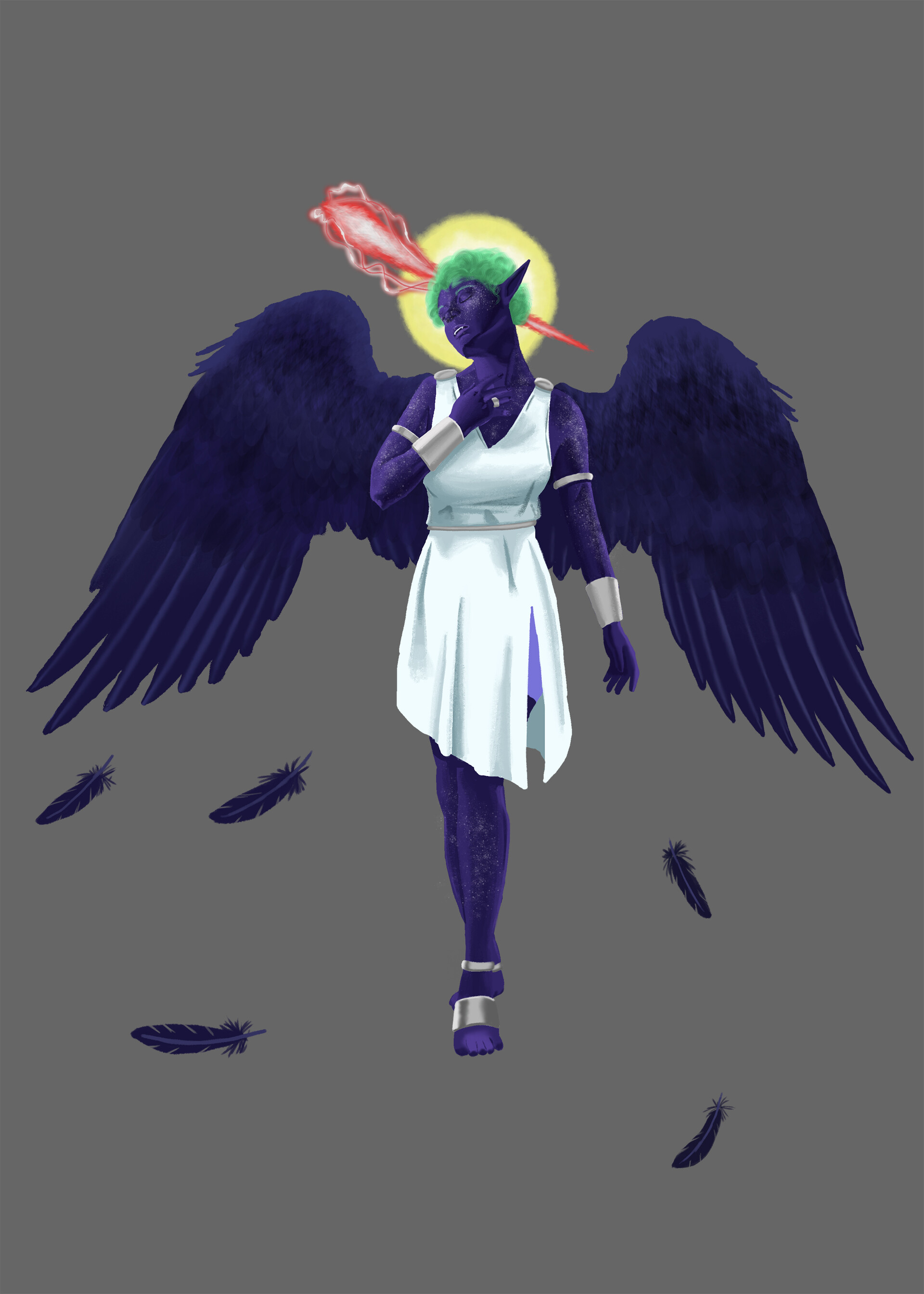
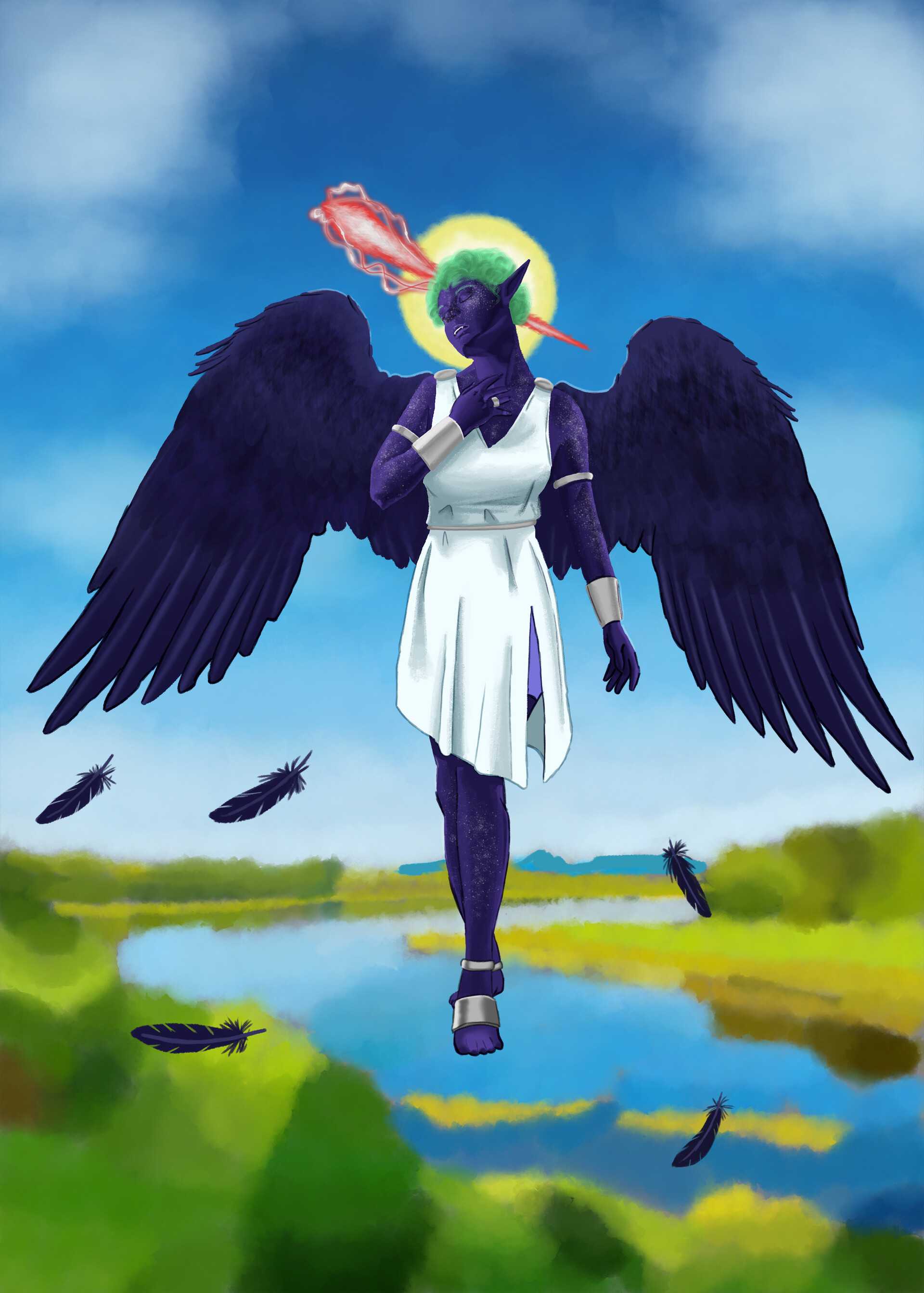
The next area of Flower's style that I adopted was the appearance of rough line work over the finished painting. While other artists likely achieve this affect by coloring their linework or letting it show through their colors, I chose to apply it after the effect, to have more precise control over the placement and colors. After that was the simple matter of painting in a rough background. I chose the setting because the moment of Kader's death was at the side of a river outside of a town. I took a very loose approach with the background, choosing to use rough suggestions of color to communicate the geography rather than any hard lines.
The final step was just to add a canvas texture on top of the painting. To do this, in photoshop I add a plain white layer and use the Canvas filter to apply the texture. Setting that layer to multiple results in a clear, toothy texture without altering the colors. However, a uniform canvas layer gives the impression of art printed on canvas, rather than painted. To fix that, I erase away parts of that texture in the area of refined detail, especially in areas with lots of rendering. It's very subtle, but effective.